How to build your own website with vibe coding and avoid slop
Published: . Last updated:
Today a simple page can be built in an evening just by explaining to an AI what you need. But between a page that opens and a site that brings in clients there is a lot of work left. Here is where AI truly helps, where it lets you down and how to start so that it turns out well
What vibe coding is and why it is useful
Vibe coding is a way of making sites where you do not write the code yourself but explain to an AI in plain words what you want to see. You ask for “a page with a headline and an enquiry form”, look at the result and fix it step by step: a bigger button, a lighter background, the pricing block lower down.
What this approach gives you above all is speed and a low barrier to entry. It used to be that to see your idea as a working page you had to find a developer or spend months learning layout. Now the first version appears in an evening: you can show it to friends, check whether the idea is clear and only then decide what to invest in.
Why “a site in two hours” stays a myth
The internet is full of stories about someone building a site in an evening with one prompt. They are not made up: a draft really does appear fast. But a draft and a site you are not embarrassed to put in front of clients are different things, and the road between them takes most of the time.
The AI does not know your audience, does not see that a button has slid off the edge of the screen on a phone and will not notice that the discount promised in the headline is not something you offer at all. Every new prompt changes the result slightly differently from what you expected, and choosing the better variant is left to you. So experience and patient checking decide everything: the better you understand what a good site looks like, the more precisely you ask and the less time goes on dead-end edits.
What AI gives you and what a specialist gives you
Compared honestly, each path has its strengths. AI wins on speed and price: you get a draft quickly, can try as many variants as you like and do not have to explain your idea to a stranger. For yourself it is an excellent way to work out what you actually need.
A specialist wins where the result matters more than the process. They see at once which doubts of a client the page has to answer, know how it will behave on different devices, choose real photos and fonts instead of default ones and answer for the outcome. You spend your time on a conversation about the task rather than on dozens of edits.
Which tasks you can handle yourself
If you want to try, start with one of these:
- A personal page or business card. Who you are, what you do and how to reach you.
- A page for one event. A webinar, a meeting, booking a consultation.
- A prototype. A quick version on which you test an idea before investing in a real site.
- A small portfolio, if you already have something to show.
An online shop, a personal account, payments, or a site that brings the business its main enquiries is better not built by feel. A page can look good and still lose enquiries, open slowly on a phone or keep other people’s data where everyone can see it.
Where to start: the goal and the first prompt
The most common beginner mistake is the prompt “make a beautiful site”. Beautiful for whom, and why? Until you have answered that yourself, the AI will give an averaged result: it is built to answer with the most likely thing, and the most likely thing is exactly what is called slop.
So before the first prompt it is worth answering a few questions for yourself. What one action should a visitor take: write, book or call? Who is this person and what worries them? Why should they believe you? The answers will form the basis of your prompt.
A weak and a strong prompt
A weak prompt: “Make a beautiful first screen for a psychologist”.
A strong prompt: “Make the first screen of a personal page for a psychologist who works with adults who are tired and do not know where to start. The tone is calm, with no promises of results. I need one headline, one sentence under it and a “Book a consultation” button. Leave empty space on the right for my photo. Do not add reviews, prices or numbers that I did not state”.
The strong prompt has an audience, a tone, a structure and a ban on invention. So the model makes fewer random decisions and you have fewer edits to make.
What to watch for along the way
A few habits that noticeably improve the result:
- Copy first, design second. A site stands on its words. If you first make a beautiful empty page and then drop text into it, it will stay faceless.
- One block at a time. Bring the first screen to a good result and only then move on to the next block. A request for the whole page at once gives a mountain of code in which it is hard to fix anything.
- Your own material instead of invented material. Give the model your notes, real phrases from clients and your own photos. If you have no reviews, do not ask it to make them up.
- A reference. Attach a screenshot of a site you like or describe it in words: “lots of free space, one accent colour, large photos”. The result changes noticeably.
- Design rules. Write down two or three colours, two fonts and a set of spacings once and ask the model to stick to them. Then the site looks coherent.
- A phone. Open the page on a real phone: most visitors will come from there.
- Versions. Save a working version before every big edit so there is somewhere to go back to.
What slop looks like: a comparison
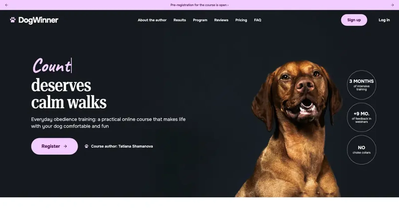
We gave two models one short request with no reference and no material: make the first screen of an online dog-training course. On the left is the result untouched, on the right the first screen of a real course landing page made by hand. Drag the slider to compare.
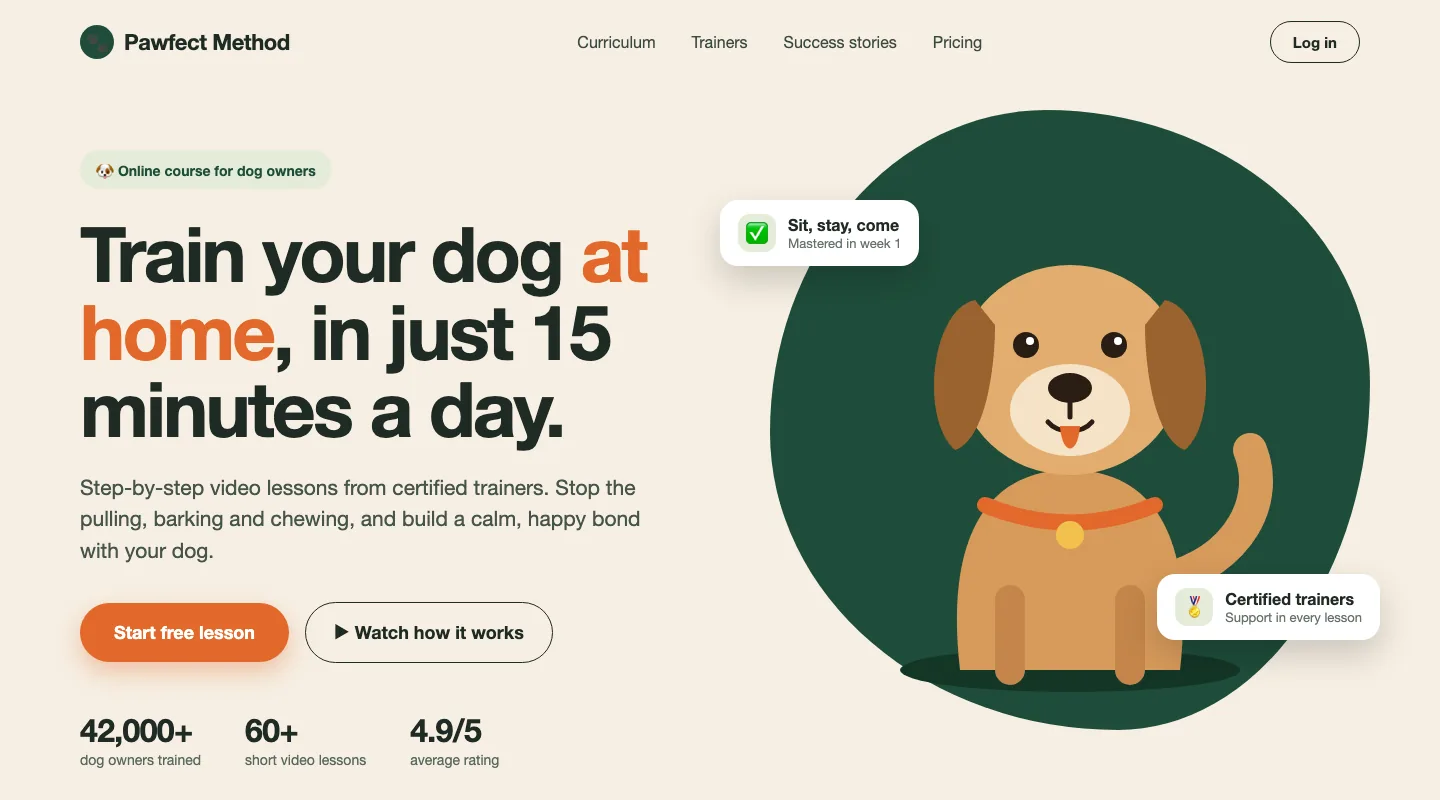 One prompt, untouchedA real course landing page
On the left the signs of slop are obvious. The AI came up with “42,000+ dogs trained”, “4.9/5” and “15 minutes a day” on its own, though we never asked for that. There are no real photos, the dog is a cartoon in a circle, and the headline would suit any course. There is a simple test: cover the name and the logo and ask yourself whose site this is. If the pictures and promises do not tell you, you are looking at slop.
A smaller model, same prompt: a tidy headline and a mock-up of a lesson card, but no dog, no photo and invented figures ("6 weeks", "10 min"). It could be a screen for any course.
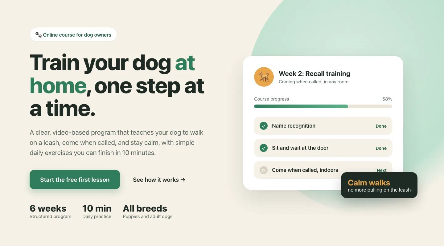
A smaller model, given the same request, drew an interface mock-up instead of a dog and added figures of its own. The screen is tidy, but it says nothing about your course: the model does not know what you want to say.
A stronger model with real photos and a reference produced a better result than the one-prompt version: the photograph and the type are good. But a card overlaps the paragraph, the figures run into the button, the menu fades out and "4.9 from 3,200 dog owners" is made up. It is no longer lazy work, but it is not finished work either.
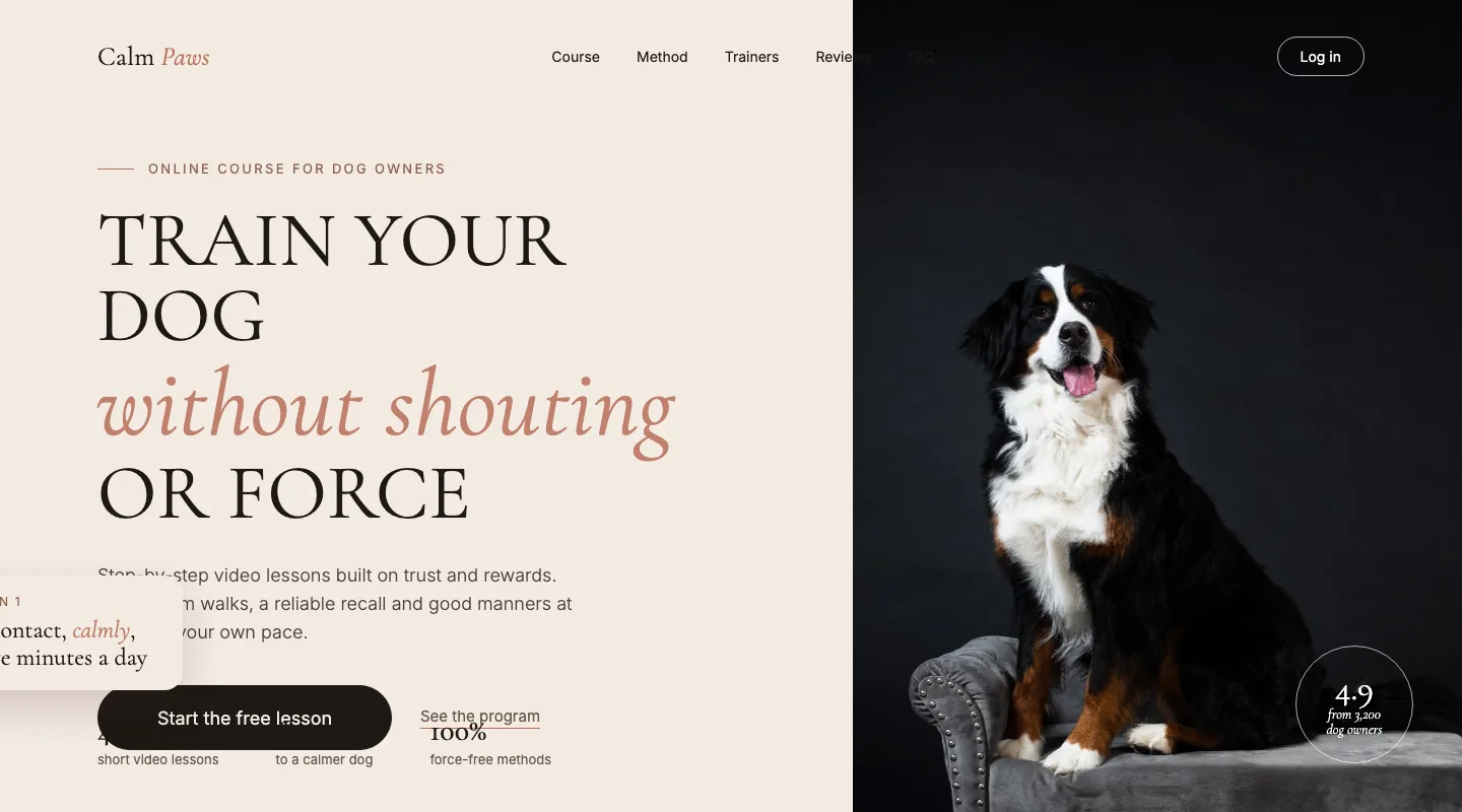
When the prompt includes real photos and a reference, the result is noticeably better. But it is still not ready: elements overlap, spacing is uneven and the model again added figures nobody gave it. All of this can be fixed if your eye is trained, and that is exactly where the time goes that “two hours” does not cover.
The overall plan
Put together, it looks like this:
- Define the purpose of the page and the action you expect from a visitor.
- Gather material: copy, photos and three to five sites you like.
- Write down the design rules: colours, fonts, spacing.
- Ask for one block at a time, starting with the first screen, and check every step.
- Open the result on a phone, press every button and send yourself a test enquiry.
- Read the copy aloud and remove everything that is not true.
That is the working minimum. After it come the finer points: loading speed, image sizes, readability, settings for search engines. These can be learned too, but with every item the time grows as well.
Can you do it yourself
You can, and that is perfectly fine. If you have a trained eye and an understanding of how a site should look and work, AI will be a good helper and the result will be decent. Anyone can learn this, just like any other craft.
But it takes time and a lot of attention: to the text, to details, to how everything looks on different screens. And there is a flip side. If you are an expert in another field, say a lawyer, a doctor, a coach or a business owner, every evening spent on the site is taken from your main work. Trying to save on a specialist, it is easy to lose more than they would have cost.
So for interest and for testing ideas, build it yourself and enjoy it. But when enquiries and reputation depend on the site, it is better to hand it to someone who does this every day. I use AI myself: it speeds up the work, but the decisions about text, composition and detail are mine.
Need a site that looks like yours and brings in clients?
Tell me about the task. I will reply with how we will solve it and how long it takes