How to make a good presentation with Claude
Published: . Last updated:

An AI writes a draft presentation in a few minutes, but a presentation after which people remember your idea does not come from one prompt. Here is where AI truly helps, where a human is still needed and how to start so that your slides do not look generic
Why use AI for a presentation
A presentation is not there for the sake of slides. It helps you get one idea across to your listeners and nudge them to act: agree, buy, remember. AI takes on what eats the most time: building a structure, finding wording, suggesting headline options and cutting long text down to a couple of lines.
Its main advantage is speed and the freedom to experiment. A draft with a plan and text for every slide appears in a few minutes, and you can ask for three different approaches and choose the best without spending a day on each. For work meetings, lectures and internal talks this is often enough.
Why “a presentation in two hours” stays a myth
An AI does not know what exactly you want to say to the room, cannot feel how much information a listener can take and does not see that a slide looks like a thousand others. Every answer differs a little from the last, and choosing the best one is up to you.
So a good result depends on experience, careful checking and several rounds of edits. The better you understand what a strong presentation looks like, the more precisely you ask and the less time goes on the unnecessary.
What AI gives you and what a specialist gives you
AI wins on speed and price. It quickly sketches a structure, helps you word an idea and suggests what can be cut. For yourself it is an excellent helper for getting to grips with the material and seeing a first version.
A designer wins where how the presentation is received matters. They build a single visual system, choose real photos and charts, make sure each slide has one main thing and take responsibility for the result. For investors, a client, a big conference or a lecture that will be shown many times, a presentation works as part of your reputation.
Which tasks you can handle yourself
AI does well with:
- A working presentation for a meeting or your team.
- A talk or lecture for a small audience.
- A student project defence.
- A draft for a designer. A plan and text for every slide that you can later hand to a specialist. It saves time for both of you.
But an investor pitch, a proposal to a big client or a presentation that a deal depends on is better not built by feel.
Where to start: the idea, the material and the first prompt
A presentation most often turns out weak because the author did not answer three questions in advance: who will listen, what the listener should remember and what they should do afterwards. Write the answers in your own words in three to five lines and paste them into every prompt.
Give the model material: notes, figures, earlier texts. The more real material in the prompt, the less it invents on its own.
A weak and a strong prompt
A weak prompt: “Make a presentation about communication in a team”.
A strong prompt: “You are helping me prepare a 20-minute talk for department heads who complain that their teams do not understand each other. The main idea: communication breakdowns are more often about how processes are set up than about people’s characters. I need 12 slides, each with a headline that is a statement and no more than three lines of text. Use only the facts from my notes below and add nothing of your own. First give me a plan, then the text for each slide”.
Ask for the text first, not a finished file. Reading a plan and headlines is quicker than editing a finished design. If the headlines, read one after another, retell the whole talk, the structure works.
What to watch for along the way
A few habits that noticeably improve the result:
- A statement headline instead of a topic. “Communication breaks down because of processes” says more than “Causes of problems”.
- One idea per slide. If a headline has an “and”, it may be two slides.
- A slide for the room, not for reading. What stays on screen is what the listener should remember; the rest you say aloud.
- Your own colours and font. One main background, one accent colour and one font that supports your language. Brand colours beat those the model picks.
- Rehearsing aloud. Slides that look good on a laptop screen look different on a big one.
- A sceptical listener. When the draft is ready, ask the model to play a strict listener and find the weak spots.
What one request produces: a comparison
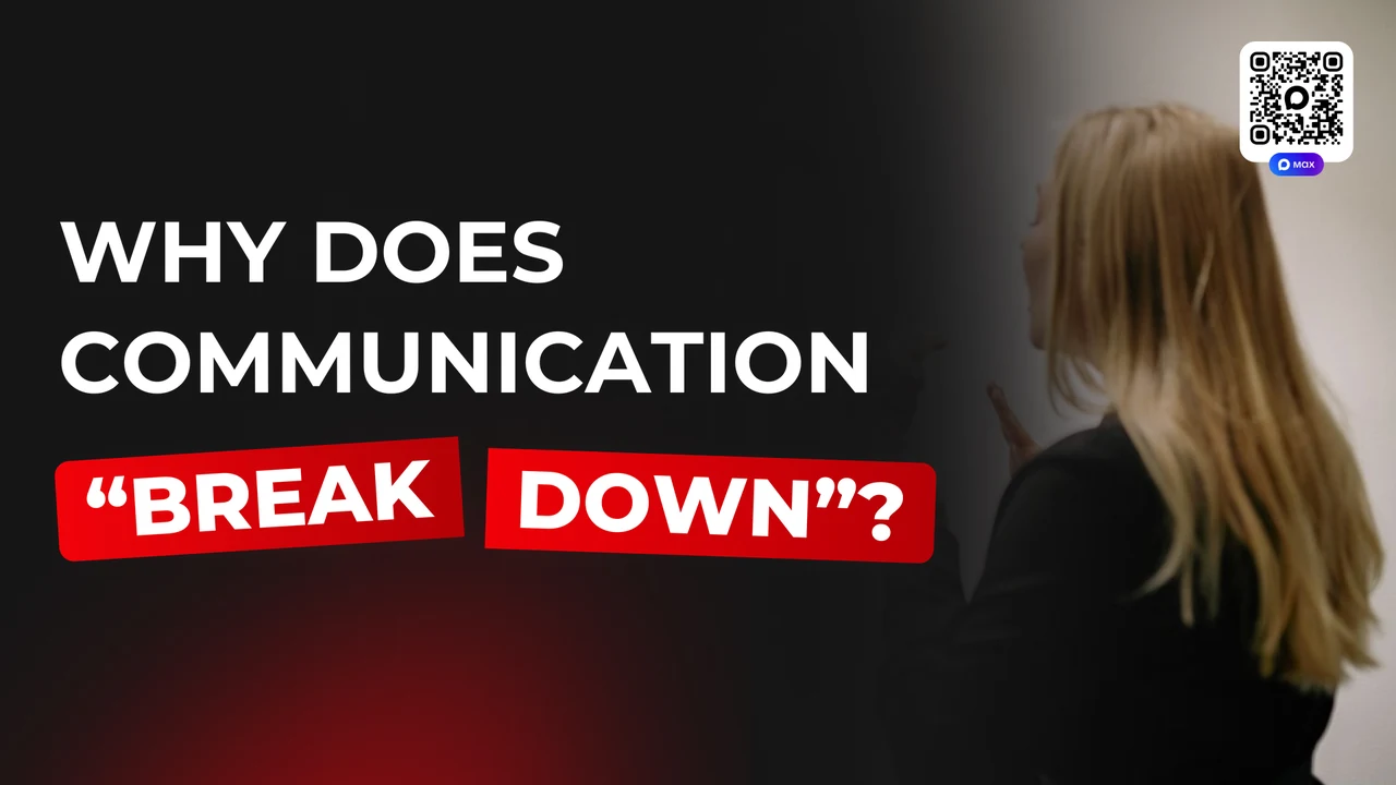
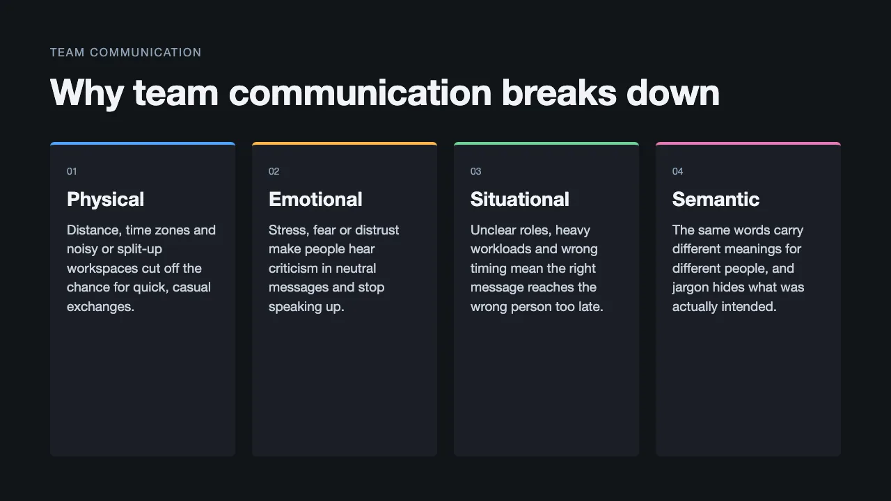
We ran a simple experiment: we gave two models one short request to make a slide about the causes of communication breakdowns. On the left is the result untouched, on the right a slide from a real lecture. They play different roles, so we are comparing the approach, not the content.
 One prompt, untouchedA slide from a real lecture
The slide on the left is tidy: the text is correct, the idea is clear and there is a structure. But it looks like a thousand others. Four identical cards, emoji icons of different styles and sizes, and the text in the last row butts against the edge of the frame. On the right there is one thesis, a large headline and a photograph, and the design matches every other slide of the lecture.
A stronger model made a calmer slide from the same prompt: a light background, a clear headline, four cards with orange rules. It is still a template: four equal cards, no images and no styling of its own.
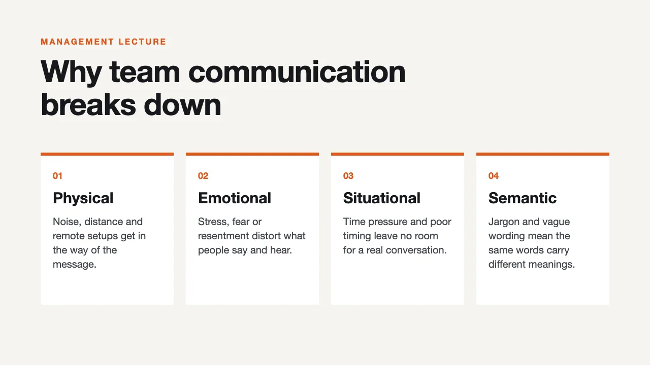
A stronger model made a neater slide: no emoji, free space and order. But the layout stayed generic, with no style of its own and no chosen imagery.
The same stronger model, now with two reference slides. It copied the colour: an orange header and orange accents. But the structure is again four equal items, and the orange circle in the centre carries no meaning. The references gave the colour, not the design.
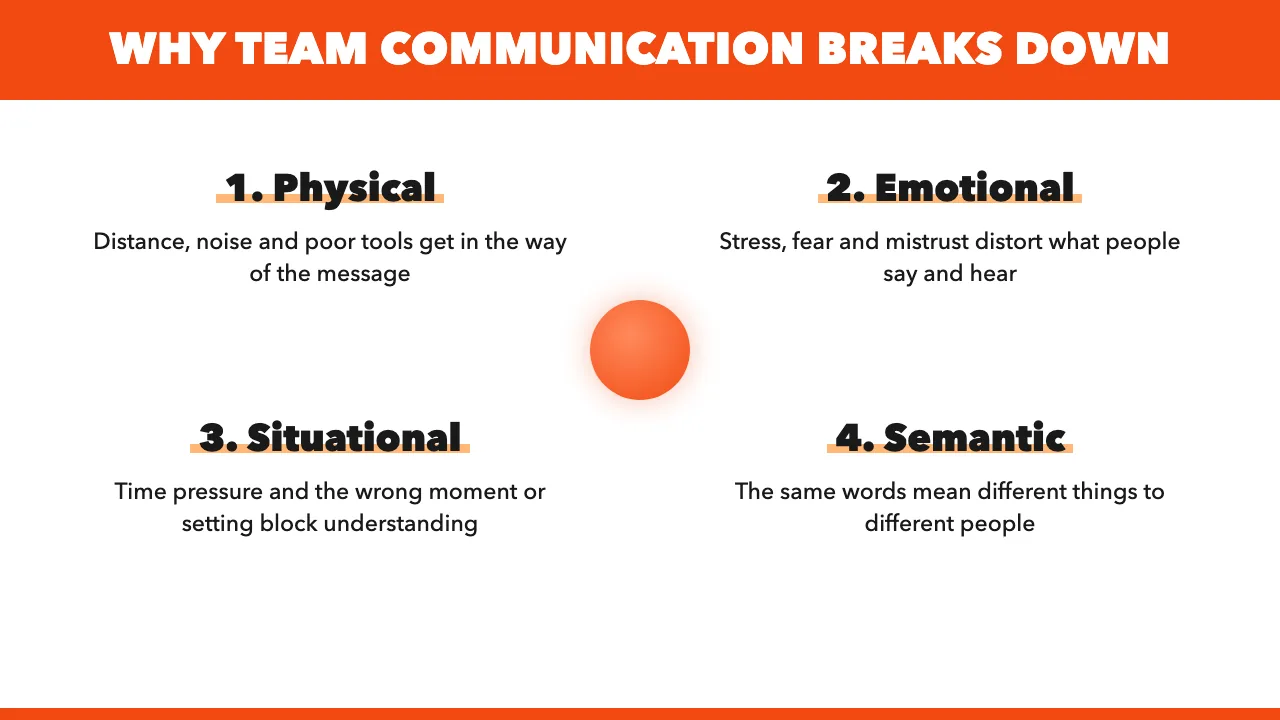
When we attached example slides, the colour changed but the layout fell apart: the headline ran onto the cards and the lines overlapped. The reference helped with colour but not with tidiness. Such a slide cannot be shown without more work, and only someone looking carefully will notice.
The overall plan
Put together, it looks like this:
- Decide who is listening and what they should remember.
- Gather material and make a plan of 8 to 12 slides.
- Ask for the text of each slide with statement headlines.
- Read only the headlines: they should retell the whole talk.
- Only then move on to design: colours, font, photographs.
- Show the slides to a friend for three seconds and run through the presentation aloud.
- Before presenting, check the screen format, embed the fonts in the file and save a PDF copy.
Can you do it yourself
You can, and that is fine. If you have a trained eye and an understanding of how a talk is built, AI will be a good helper and the presentation will be decent. Anyone can learn this, just like any other craft.
But it takes time and a lot of attention: to the idea, to details, to how everything looks on a big screen. And there is a flip side. If you are an expert in another field, say a doctor, a lawyer, an entrepreneur or a teacher, the hours spent on slides are taken from your main work. Trying to save on a designer, it is easy to lose more than they would have cost.
So for working talks and for testing ideas, build it yourself. But when a presentation affects a deal, money or reputation, it is better to hand it to someone who does this every day. I use AI myself for speed, but the decisions about the idea, composition and detail are mine.
Need a stylish presentation worthy of a professional?
Tell me about the task and the deadline. I will reply with how we will do it and how long it takes